Why can the same fabric look different in two views?
The April development notes describe custom shaders that make fabrics look distinct, including different kinds of shininess for silk and velvet. May Tea then describes an inventory-preview revision intended to show those highlights more accurately. A small flat-looking swatch and the folds of a finished garment provide different views of the same material.
Start by confirming the selected name and category. If those have not changed, compare the camera and the shape carrying the material before deciding the game replaced the fabric. The historical figures on this page illustrate the developer’s explanation; the installed game remains the place to read current labels.
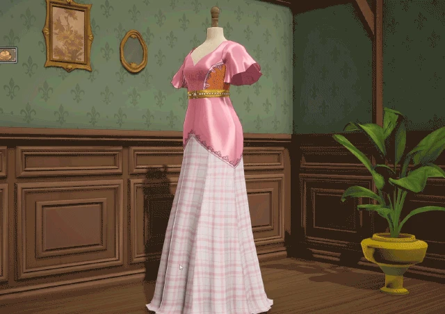
A still frame from the official April fabric-rendering demonstration.
- Compare the lit pink area with the darker folds on the same dress.
- This single frame illustrates the scene; it does not reproduce the changing highlights of the full animation.
Pre-release media published April 15, 2026. This image does not establish the Build 443 interface or item unlocks.
Cozy Lives / Free Lives
Read the original publication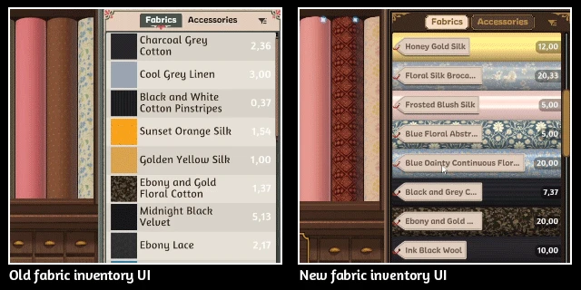
The official May inventory comparison shows the older and revised fabric previews.
- Read the old/new interface labels before comparing the fabric samples.
- Use this historical comparison to understand the preview change, then read current item names in your installed game.
Pre-release media published May 27, 2026. This image does not establish the Build 443 interface or item unlocks.
Cozy Lives / Free Lives
Read the original publicationWhat can you read from the official examples?
The April comparison focuses attention on light response. Look at the broad lit area, the darker fold and the transition between them. The May inventory example shows how much a preview and its surrounding labels affect the material you think you selected. The post says the full name appears on hover so that more of the swatch remains visible.
Neither view should be reduced to “brighter is better.” A bright highlight can make a colour appear paler, while a shaded fold can look darker without changing the item’s label. For a commission, check the actual requirement row after using the material.
How do you make a useful swatch comparison?
| Keep steady | Compare | Write down |
|---|---|---|
| Component shape | Two candidate materials | Exact names and categories |
| Camera angle | Highlight and shadow boundaries | Where detail becomes difficult to read |
| Main design | Printed versus plain areas | Which area should attract attention |
| Commission brief | Relevant progress row | Whether the candidate changes the required condition |
Choose one familiar component rather than redesigning the whole dress. First compare a wide section where the material is easy to read, then a narrow or curved section where highlights are compressed. Return to a full view and ask whether the intended colour arrangement still reads clearly.
This sequence produces a visible comparison you can describe: one candidate separates the folds more clearly, another makes a print more legible, or one competes with the focal decoration. These are design observations. Use the fabric selection guide for labels and the component requirement guide for Build 443 colour and material progress.
How do pattern scale and sheen interact?
A small repeated motif can be easy to see in the inventory yet difficult to distinguish when divided among narrow panels. A broad plain area can expose changes in light more clearly than a busy print. Inspect both the material sample and the assembled component, rather than choosing only from the prettiest thumbnail.
For a border or gradient, check which portion falls within each piece. The print-planning guide keeps that question separate from grain quality. The new October catalogue names the added shot and gradient silk group without assigning unpublished values to the fabrics.
What if bright effects hide the detail you need?
Build 443 adds a bloom option. If a bright area is hard to inspect, compare that setting while keeping the garment and viewpoint steady. Less Animation addresses scrolling textures and certain zoom effects; it answers a different problem from material classification. The camera and accessibility reference lists each option’s stated scope.
Do not change resolution, bloom, camera and material in one pass if you want to identify the source of a difference. Record the scene and the setting you changed. If the effect is a momentary flash in the cutting room rather than a fabric highlight, describe it as that symptom when reporting it.
What should you record before buying more?
Keep the material name, current price, intended quantity and the component that will use it. A preview helps choose appearance; the purchase decision also depends on the budget and required finishing items. The budget guide provides a purchase worksheet so a visual comparison does not become an unnecessary inventory purchase.
Sources and historical context
Checked 21 October 2026. Fabric rendering and inventory explanations come from the official April and May Tea development records, published before launch. Current option facts come from Build 443. The publisher press kit provides the broader gameplay context. Inspection steps are editorial, not firsthand test results or hidden scoring rules.